

Employer: University of Cambridge
Date: 2013-2025
Tools: Excel, Flourish, Illustrator, Python, Premiere, After Effects
Category: Data design
Brief: Data storytelling: presenting data in a visual story on emissions and carbon capture capacity for high profile talks by Cambridge University scientists
Result: A set of graphics used in high-profile talks by researchers which make clearer some of the most important data around climate change and the deployment of CCS technology
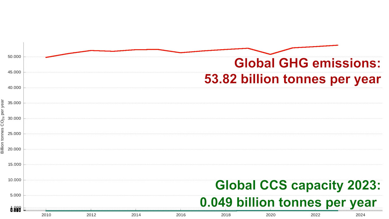
1. Visualising the gap (video animation)
This was the original problem which inspired this whole sequence of graphics.
So much of the conversation around climate solutions focuses on technology - particularly carbon capture and storage. Research colleagues and I were trying to show that we are not putting enough focus on energy demand reduction, but we kept running into the same problem: it was impossible to show global emissions and CCS capacity on the same y-axis (vertical axis) because the CCS capacity is still less that a thousandth of emissions - and so the line sits on the x-axis. The static graphic was meaningless.
I realised the only way to truly communicate the gap was to animate the graph. I used Python, After Effects and Premiere to compare total global emissions (top line) with carbon capture capacity (CCS) (bottom line) in this animated graph.
The first time this graphic was used in a talk, an audible gasp spread throughout the theatre. The audience had some idea that CCS wasn't going to solve all our problems on its own - but this was the first time they truly saw it. If we are going to rely on CCS as a primary solution to climate change, current expansion is nowhere near fast enough to mitigate today's emissions on its own.
2. Mapping Emissions: Population vs Emissions (interactive)
I also needed to set the underlying context about climate change by looking at greenhouse gas emissions. One of the most common comments in this field is 'what's the point in European countries taking action if China does not?'
So I created these interactive maps using Flourish to show the link between greenhouse gas emissions and population. We can see from the first map that China certainly is densely populated - but it's not alone - India is right there as well.
If you use the arrow to move to the next map, the countries are highlighted this time by their greenhouse gas emissions. That confirms the original comment, right? China has a huge emissions footprint, despite having a similar population to India.
This is where it gets interesting. Let's try and combine those two measures and consider greenhouse gas emissions per capita - is China at the top?
Well, no. The oil rich nations of Oman and Saudi Arabia are closely followed by Russia, Australia and the US. However, it's worth noting that countries usually report their production emissions, not their consumption emissions. That means that they are not accounting for the emissions from imported goods.
Which nations suffer the most impact from climate change? The forth map in the series shows it's not the ones producing the emissions.
3. Global Emissions Treemap (Interactive)
I created this interactive treemap to group emissions by country and enable comparison with data on offsetting and deforestation. This is showing emissions per continent, and is clickable to show the share within those continent groups as well.
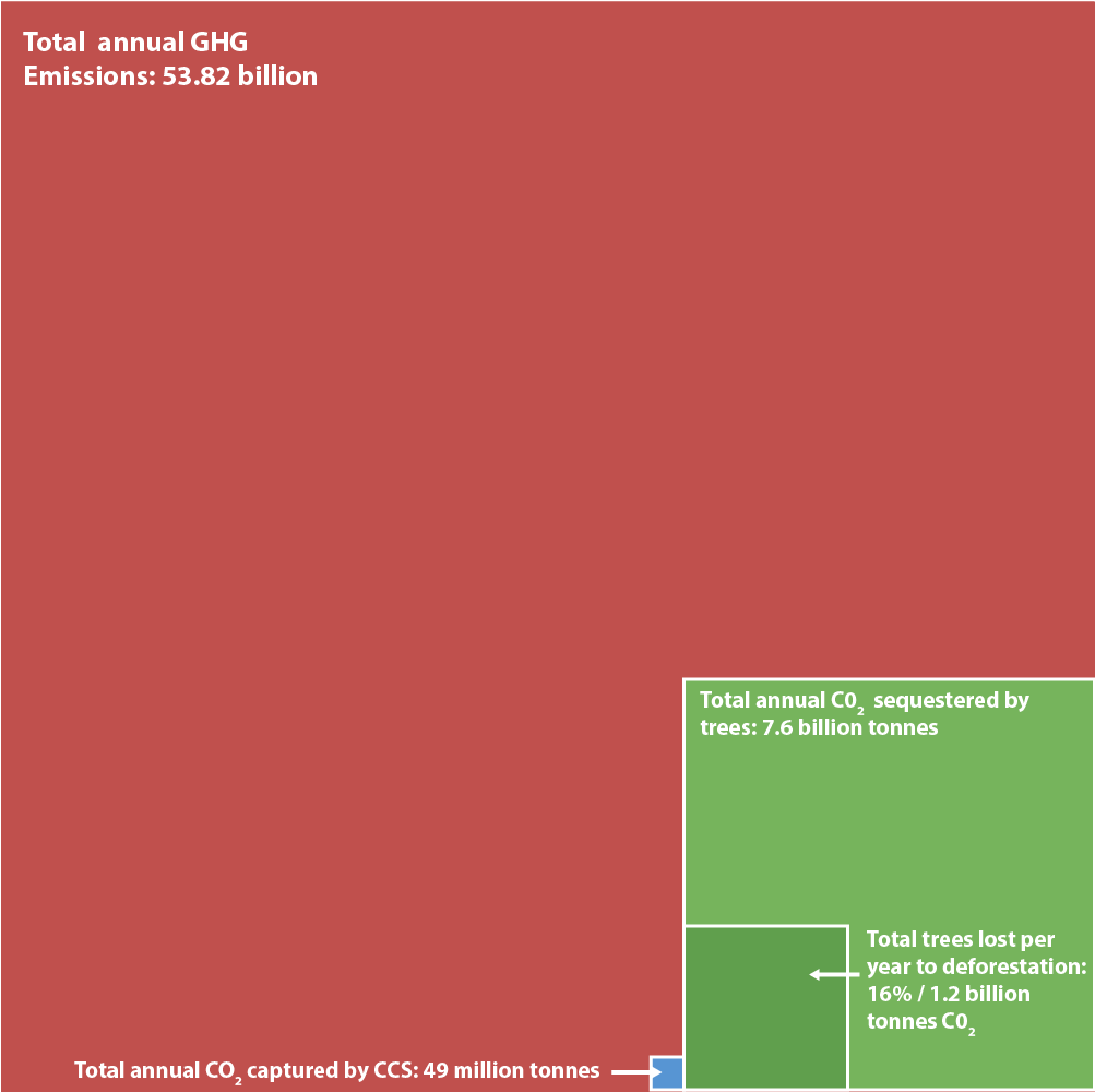
4. Putting It in Perspective: Trees vs CCS (static)
This static treemap compares:
• Total carbon sequestered by trees annually
• Carbon offsetting lost to deforestation
• Global carbon captured by CCS. You might have to look closely!
5. Zooming Out: CCS vs Forests at Scale
If you revisit the interactive treemap above, you start to get a picture of the scale of the problem. CCS offsets emissions equal to Singapore's output - a country with population of 6 million people.
• Meanwhile, trees offset emissions of North and South America combined (population of 1 billion people).
And so, through a range of data visualisation techniques, my academic colleagues present a stark question: Why does so much climate mitigation policy rely on CCS capacity, yet deforestation continues?
In communications about global issues and the climate, the data are the drivers of our stories, the motivators of our action, and the evidence by which we make decisions about how to decarbonise. I use powerful data visually to tell those stories, in static for print and online, animated for video, and interactive formats. I did the UX / UI design for ZERcalc, an interactive emissions, energy and resources calculator aimed at supporting emissions-producing industry in mapping their resource efficiency. I also made the tutorial video and led the industry outreach programme.
Map boundaries source: World Bank Official Boundaries
Population and emissions sources:
Our World in Data – CO₂ Emissions
For national greenhouse gas (GHG) and CO₂ emissions (total and per capita).
For national greenhouse gas (GHG) and CO₂ emissions (total and per capita).
Our World in Data – Population
For consistent 2023 population figures.
For consistent 2023 population figures.
Global Carbon Atlas
For detailed emissions estimates for smaller countries/islands where available.
For detailed emissions estimates for smaller countries/islands where available.
World Bank Open Data
As supplementary data on GHG emissions and country-specific per capita figures.
As supplementary data on GHG emissions and country-specific per capita figures.
United Nations Statistics Division and CIA World Factbook
For territories and regions without consistent data elsewhere (especially populations of small or disputed territories).
For territories and regions without consistent data elsewhere (especially populations of small or disputed territories).
CCS data source:
Global GHG data: Jones et al. (2024) – with major processing by Our World in Data (https://ourworldindata.org/greenhouse-gas-emissions)
CCS data: Global CCS Institute, Global Status of CCS 2020 (https://www.globalccsinstitute.com/wp-content/uploads/2021/03/Global-Status-of-CCS-Report-English.pdf) and Global Status of CCS 2024 (https://www.globalccsinstitute.com/wp-content/uploads/2024/11/Global-Status-Report-6-November.pdf)
Countries most at risk from climate change: https://www.germanwatch.org/en/cri