Reclinker is a fantastic new company with cimate mitigation at the heart of their organisation. They commissioned me at the end of 2024 to lead their rebrand with a new logo. The aim of this process was to begin by exploring many options, and then refine and evolve it throughout the process. My first mood boards therefore experimented with a wide range of options, which we refined iteratively until they had exactly the logo they wanted. This whole process was completed in under two weeks.
Client: Reclinker: A zero-emissions cement company
Brief: Rebrand company with new logo
Brief: Rebrand company with new logo
Step 1
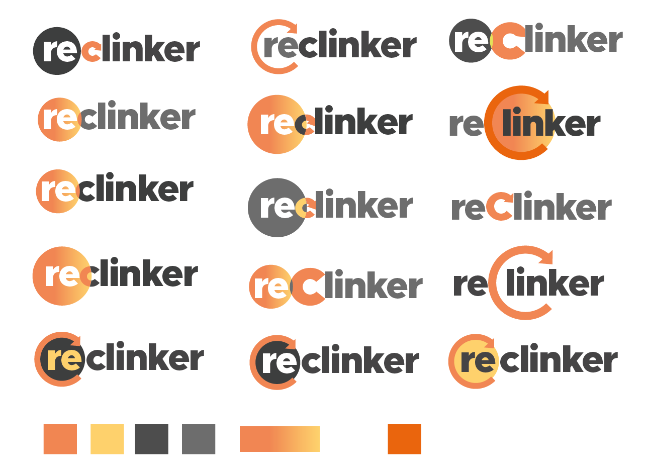
I met with the team and discussed the aims of the company, their audience, and any initial likes and dislikes. I then produced first three mood boards experimenting with colours, fonts and flourishes. I created a colour palette using pictures which related to the company as inspiration, and experimented with shapes relating to construction, cement and electricity. I was most struck by using circles to reflect the circular nature of their novel recycling process.
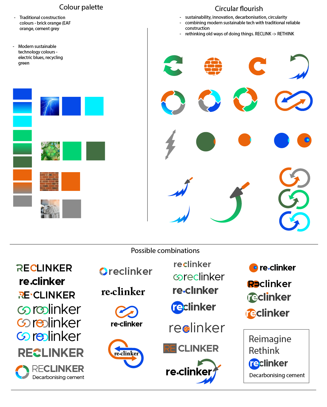
Exploring colours, text and features
Developing into logos
Exploring colour versions
Step 2
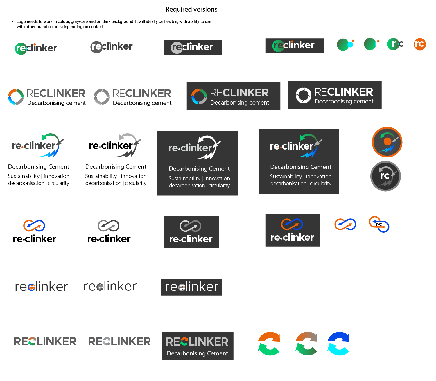
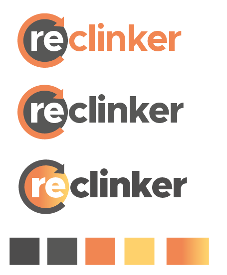
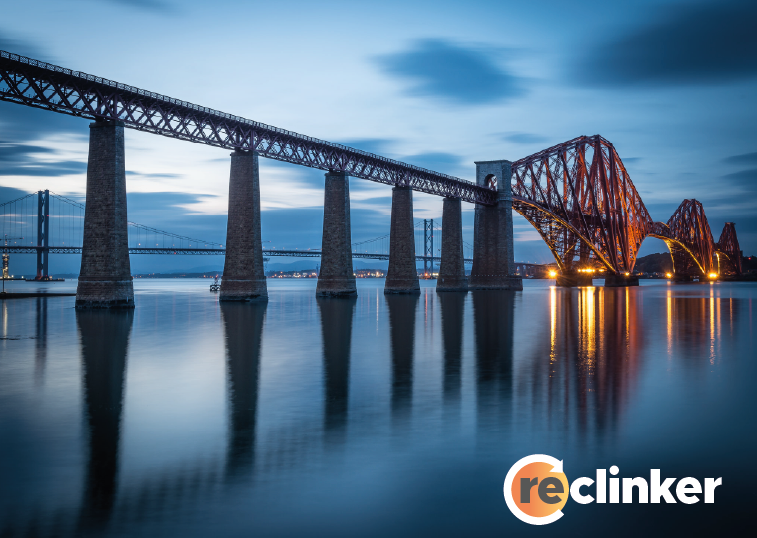
The company discussed all these ideas and decided they wanted to develop the example with 're' within the circle. The circle symbolised the circularity of the process and they liked the circular arrows, symbolising recycling. They were keen to use a similar orange, but a softer shade, and wanted to bring a warm yellow into it. They wanted to stick with the Metropolis font. This font is in my top-ten favourite fonts. I love this font for this type of project as it has a very modern feel, and so many variations within the same family (light, medium, bold, extra bold, black etc). With this weight, it has such clarity . It seems to say "here we are" - the perfect bold introduction for a company taking the world of sustainable construction by storm. It also looks great placed over an image because it keeps its integrity even with a busy background.
Time to combine the original ideas with their feedback! The next mood board arrived with them within a day or two.
Second mood board
Step 3
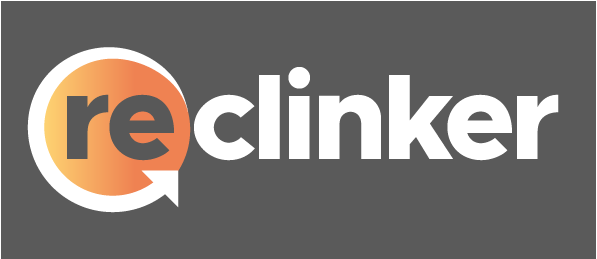
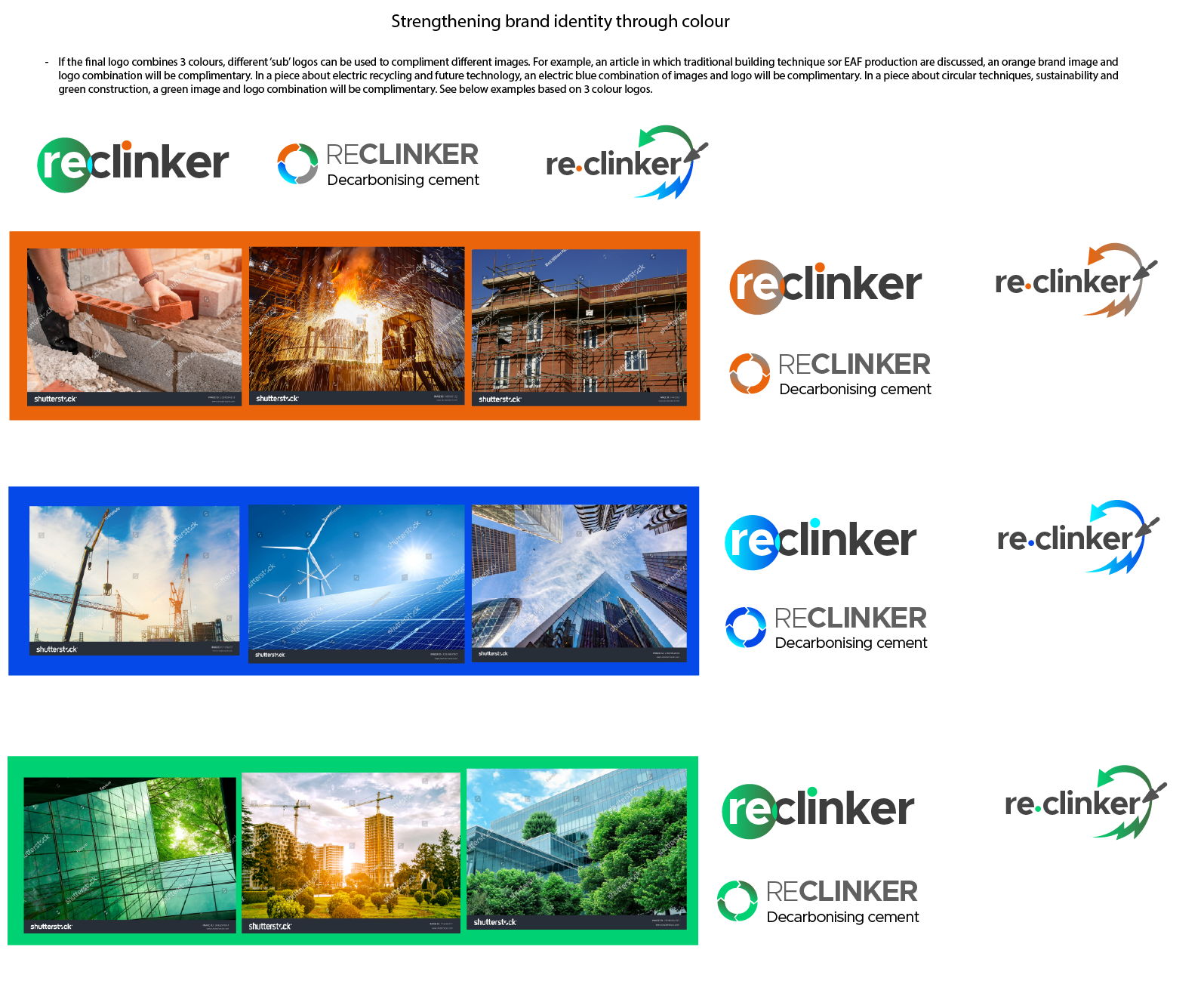
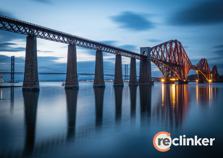
Another company meeting, and they were really keen on the bottom row, but they weren't completely sure how they wanted their colours - so I explored this, and included some inverted versions placed over images so they could see them in context. It's important to think about the different uses of a logo early on in the development process.
Step 4
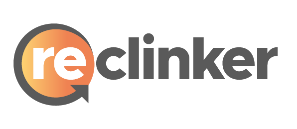
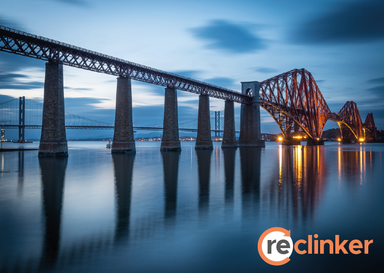
They settled on the version with the gradient circle, and decided they wanted to reverse the direction of the arrow. I live-edited the final touches with a shared screen on a call with them so they could make their final decisions. Together, we tweaked the gradient circle and the text shade. Finally I made sure everything was perfect, tucked in the tail of the arrow, and sent over their logo pack, including versions for digital and print, editable (including both editable and outlined text) and inverted. They launched their brand in May 2025.